The Visual Connection - Designing lessons Part II
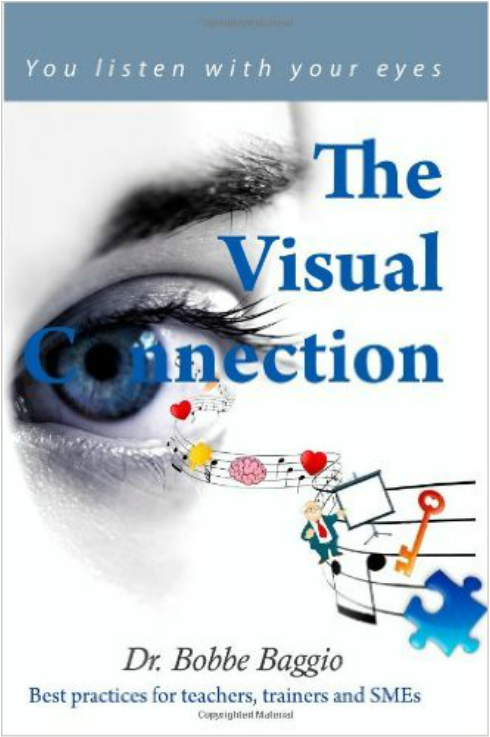
In Chapter 10, Dr. Baggio discusses CRAP, which is an acronym for Contrast, Repetition, Alignment and Proximity.
He writes "These are good design basics. Remember all visual design for learning is also good visual design"(page 93). Contrast brings your eyes to the page, with one major and at most two focal points. Font, color, size, texture, space and difference are all useful tools that can help create contrast. |
|
Research has indicated that repetition enhances the probability of learning taking place. Alignment, the third element of good design, is all about symmetry, asymmetry, positions, positive and negative space. “Alignment is more than just lining things up; it is a way to direct where the eye falls on the screen, making it easier for the learner to take in the image" (page 107).
I had never been taught about using alignment in creating a presentation, but my young daughter would often come home from school and teach me what she learned in art class, so I naturally incorporated those ideas it into my presentations.
Proximity, the final element of design, is about relationship, agreement, balance, scale, and harmony. Designers create proximity by using scale, balance, position and size. I was familiar with this concept as well, due to my experience in sizing elements of my lessons so that students in the back of the classroom could see them easily.
I highly recommend this book, as Dr. Baggio offers many examples and explains how to use the four design elements to enhance learning.
Below are links to a few lessons I created to try and incorporate some of the design basics covered in the book.
Lesson 3 Two-Step Inequalities
Lesson 4 Combining Like Terms
SITE Model Review
Sociocultural, Informational, Technical, Educational (SITE)
This week in my TU program we looked at various instructional design models. My favorite was the Pebble in the Pond Model by Merrill. I liked it because it focused on making content relevant to learning. In math, students often ask "Why are we learning this?” or “When will we ever use this?" In alignment with the new Common Core standards, the focus is to first present a problem that students come across in real life, in which they naturally understand why the concept/content is relevant.
For example, instead of telling students that they are going to learn about percentages, the instructor can show them two coupons, and ask which is the better deal, or a dinner receipt where they are required to calculate the appropriate tip. Students begin engaging and asking questions as a result of this practical approach, and many end up with a desire to learn, instead of being forced into rote memorization.
Other approaches were shared in class as well. Even with years of teaching experience I did what I was told without fully understanding why, as models of teaching and design have changed over time. Now, with the new technologies that are available, a sea change is on the horizon, and debates about best practices incorporating these new technologies are inevitable.
I found that the SITE model presentations in TU class showcased some great ideas. I too am now rethinking next year’s teaching strategy, in terms of how to better reach all of my students via sociocultural, informational, technological, and educational lenses.
My TU program also asked us to read Dr. Bobbe Baggio’s book The Visual Connection, in which the focus was on creating lessons that visually stimulate and enhance learning for our students. I have been focused on “teaching to the eyes” most of this semester, and have created several pre-lessons that offer a basic foundation to the problem-solving expected of students, and also foster better progress through inquiry labs and performance tasks. My students and I really enjoyed these lessons.
Chapter 13: The Answer is Not to Ban PowerPoints and Chapter 14: Use of Color were particularly inspiring to me. The next steps in the learning process might be to have the students create graphics that explain their problem solving methods.
To quote from the book: "Designing instruction so that the mind can take it in is both an art and a science. The discipline of instructional design combines a lot of different skill sets and is, at a minimum, a marriage of several worlds: psychology, education, art, and technology" (page 29). Good instructional design takes time, and this is what makes teaching exciting for me. Nothing makes me happier than a student that learns from my visual creations. Yet although learning and teaching this way is fun, Baggio notes in Chapter 7 that "If it doesn't go in, It can't come out!" This chapter reminds us that content is king, and that educators must "always strive to align the learning and the learner's attention" (page 61).